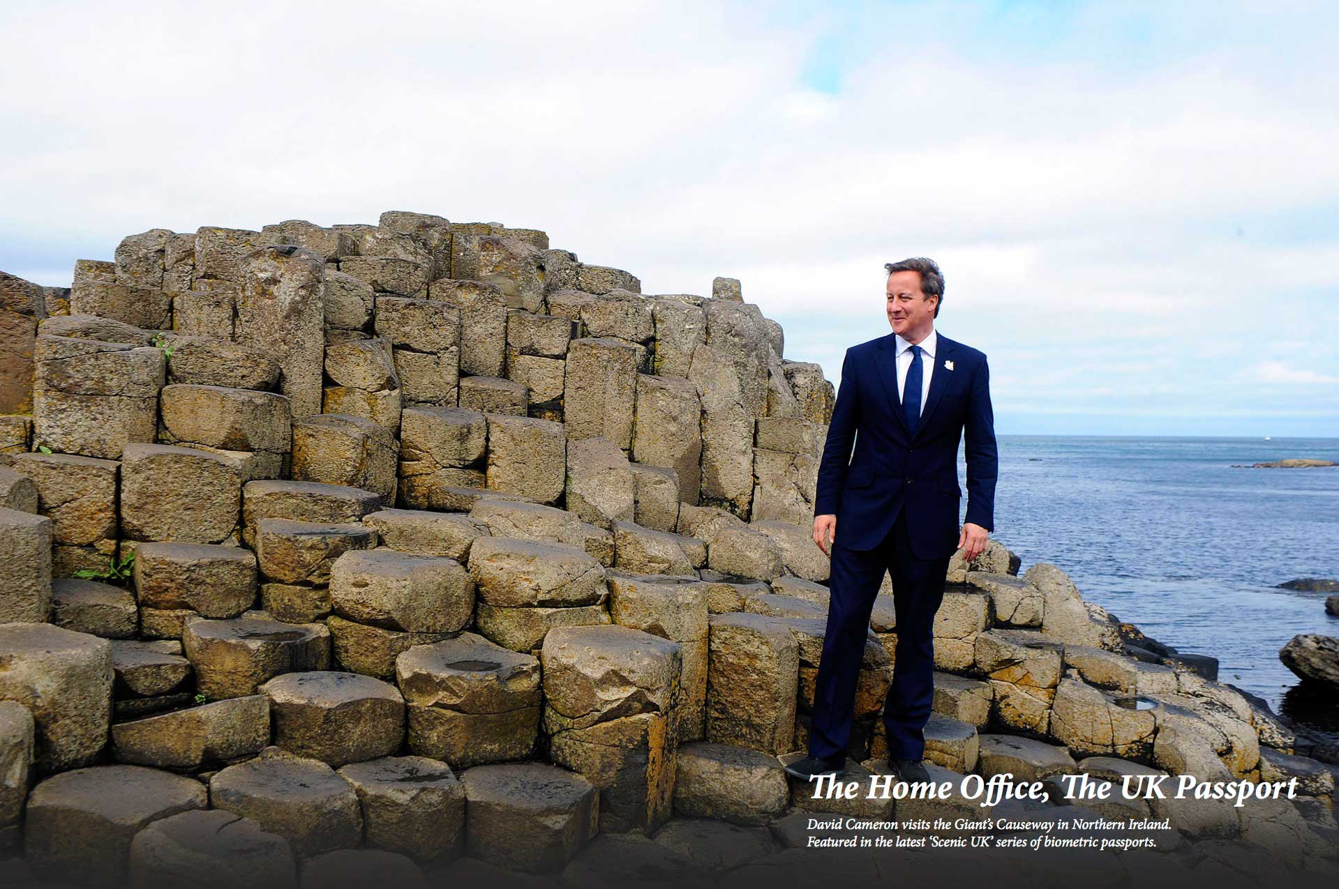
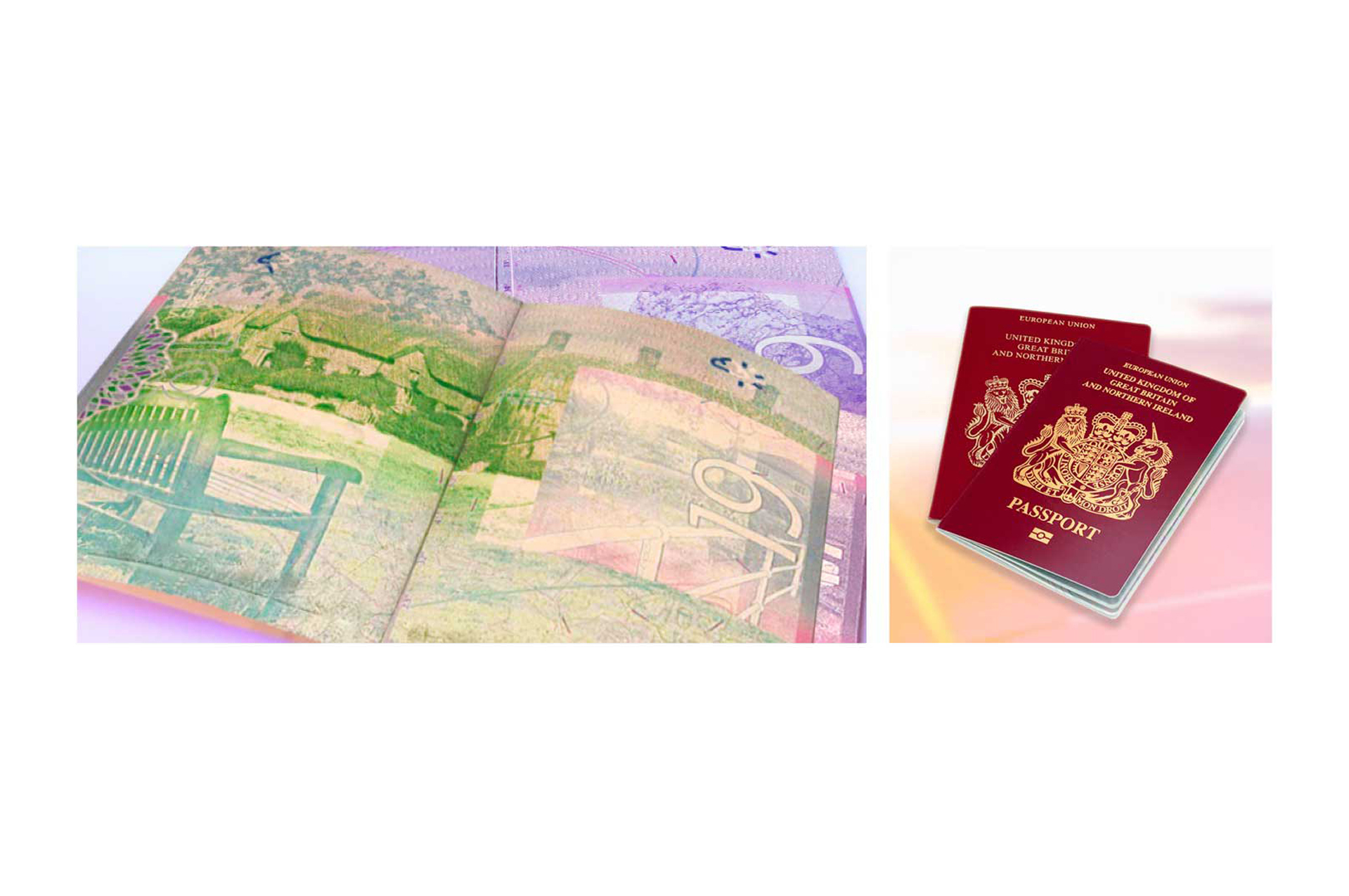
Brief: Create a secure redesign of the British passport. The Home Office required an aesthetically pleasing book design with features providing reassurance against counterfeiting.
Result: The finished passport exceeded all expectations. Functional security features blend seamlessly with picturesque views displaying the beauty at the heart of our country to citizens and visitors alike. Line drawings feature classic landscapes such as the White Cliffs of Dover, The Gower Peninsula, Ben Nevis and The Giant’s Causeway.
Skills: Design direction, creating from concept through to completion, storyboarding, stakeholder management, team management. Adobe Illustrator, Photoshop, InDesign
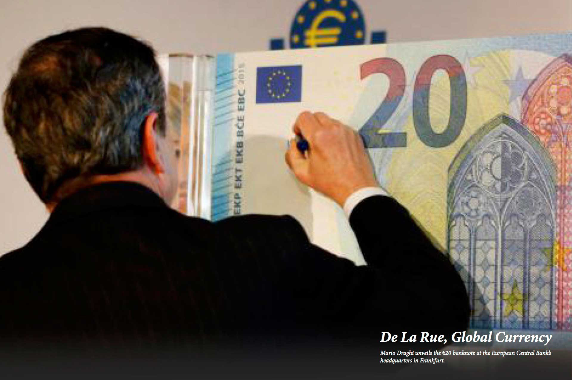

Brief: De La Rue is the world’s largest commercial banknote provider for central banks and commercial organisations. The company is tasked with the design and print of new currencies on an ongoing basis.
Result: During my tenure, I completed design elements for twenty seven denominations of world currencies. These banknotes consist of an array of bespoke design features and can be found in circulation worldwide.
Skills: Design direction, sketching and drawing, stakeholder management, composition, team management, project management. Adobe Illustrator, Photoshop, InDesign.
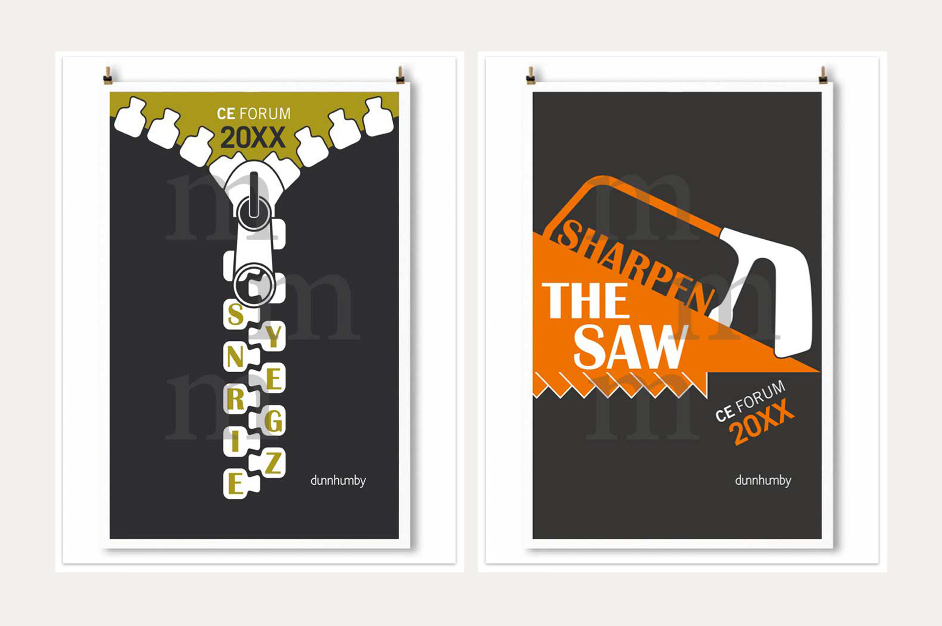
Brief: Dunnhumby required identities for a customer eduction leadership conference based on two theories from Stephen Covey’s book "The seven habits of highly effective people".
Result: The complete identities use tools as a metaphor to highlight Covey’s principles, illustrating the synergistic nature of effective teamwork and the importance of skill development.
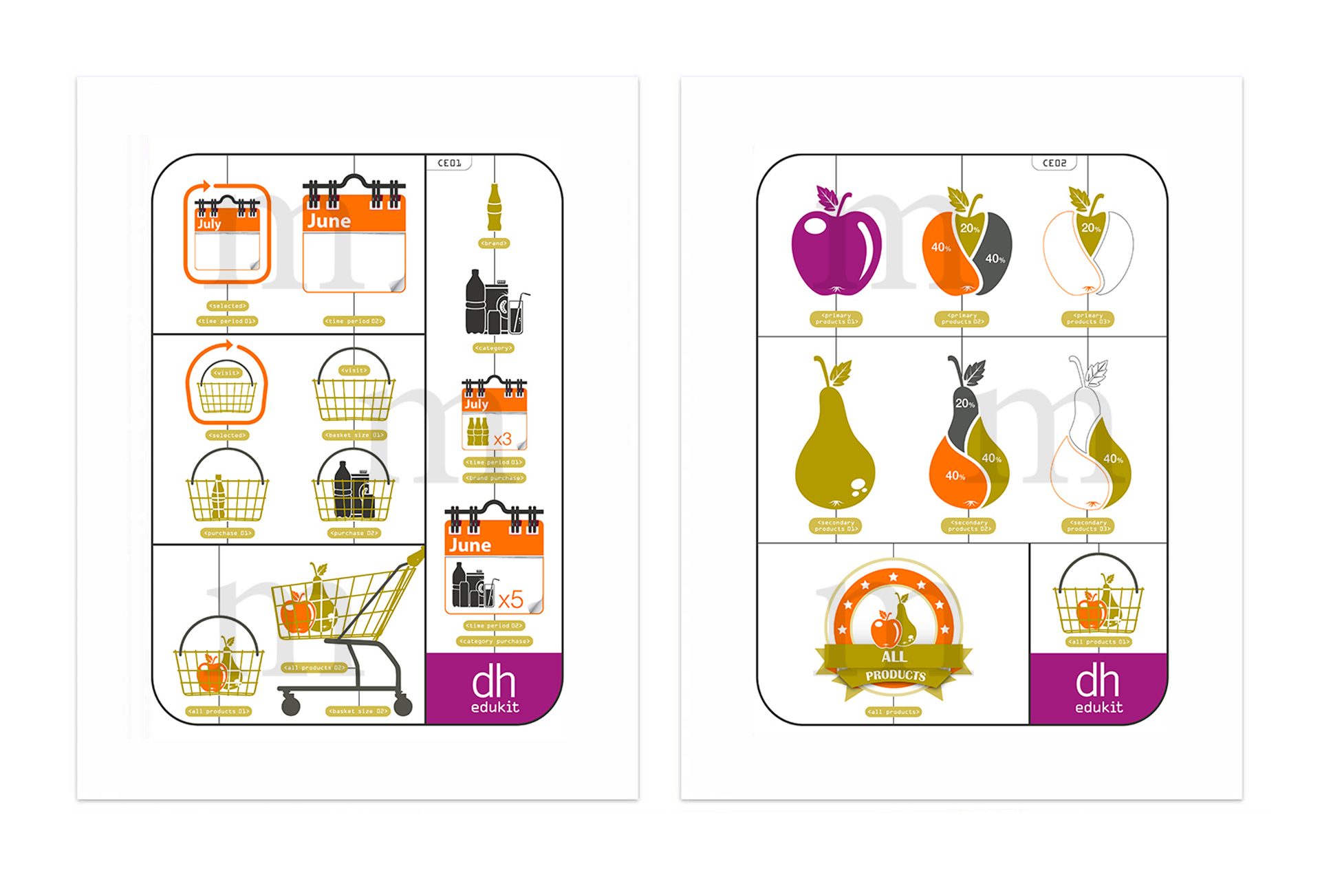
Brief: Dunnhumby, the world’s largest customer science company, required a set of icons for a digital asset library designed to communicate complex equations and drive brand consistency.
Result: The completed set of icons works to evolve the Dunnhumby brand and forms a bespoke visual language, which furthers customer knowledge across multichannel platforms.
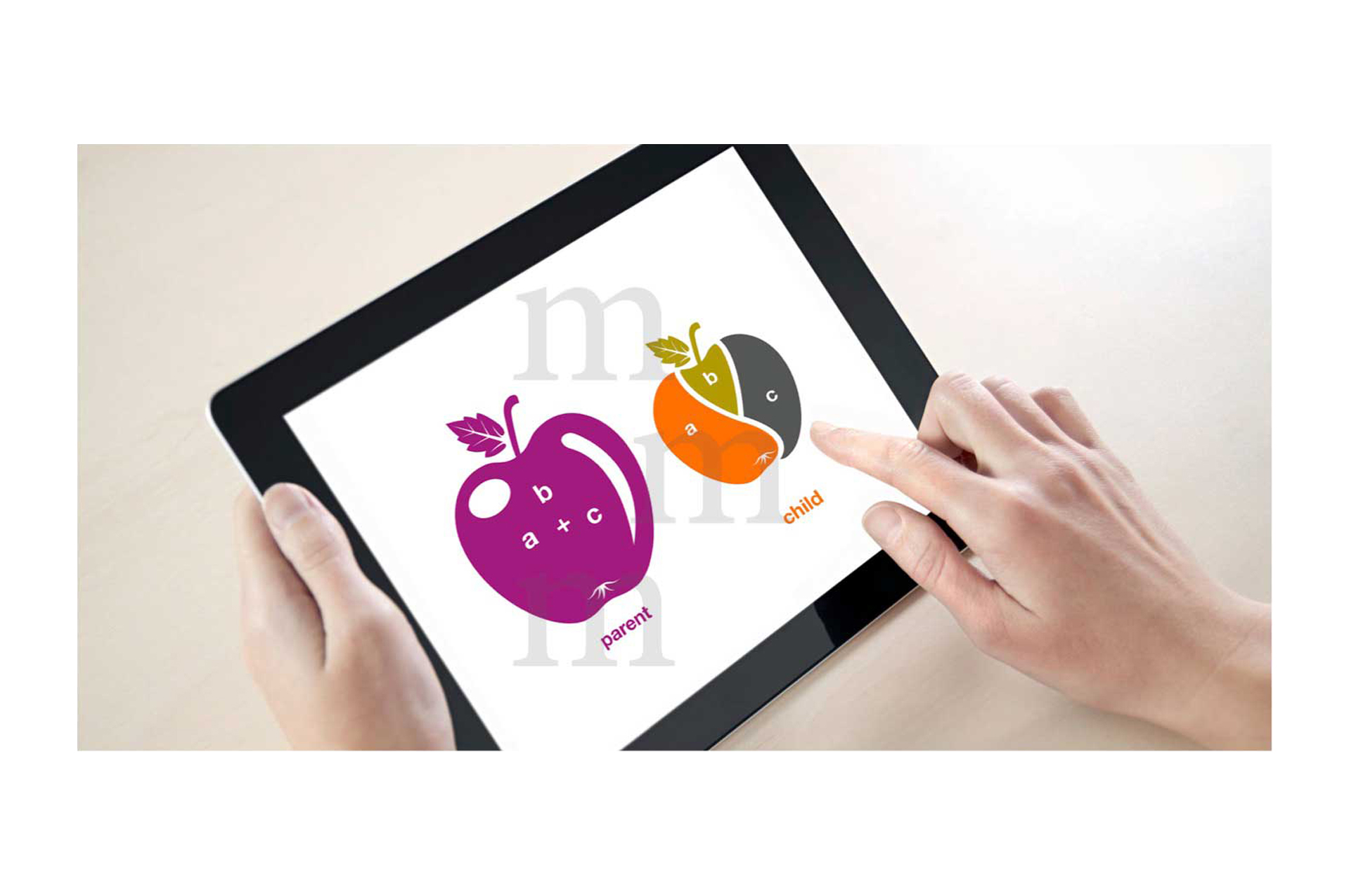
Branded icons from the library are used to create functional applications for mobile devices.
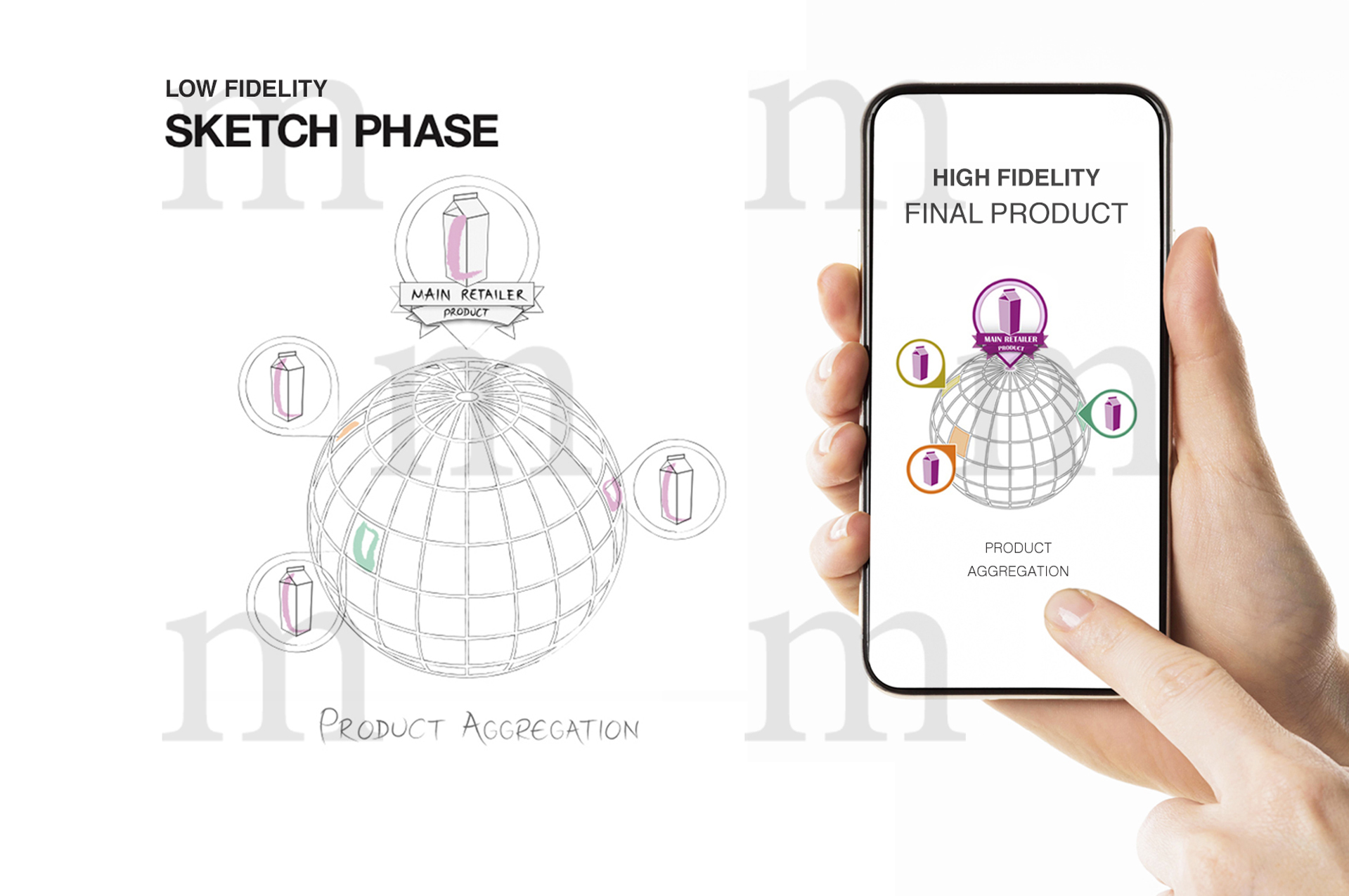
Low fidelity sketch phase, moving to high fidelity digital interfaces for mobile devices. Well-planned design patterns are used to communicate consistent meaning and knowledge. Customised visual assets provide a consistent global message throughout the final product.
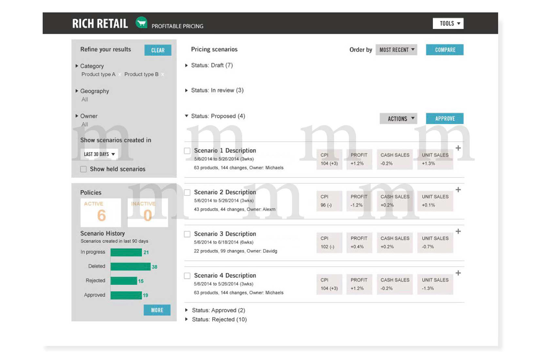
UI design for pricing applications, following the results of UX design processes.
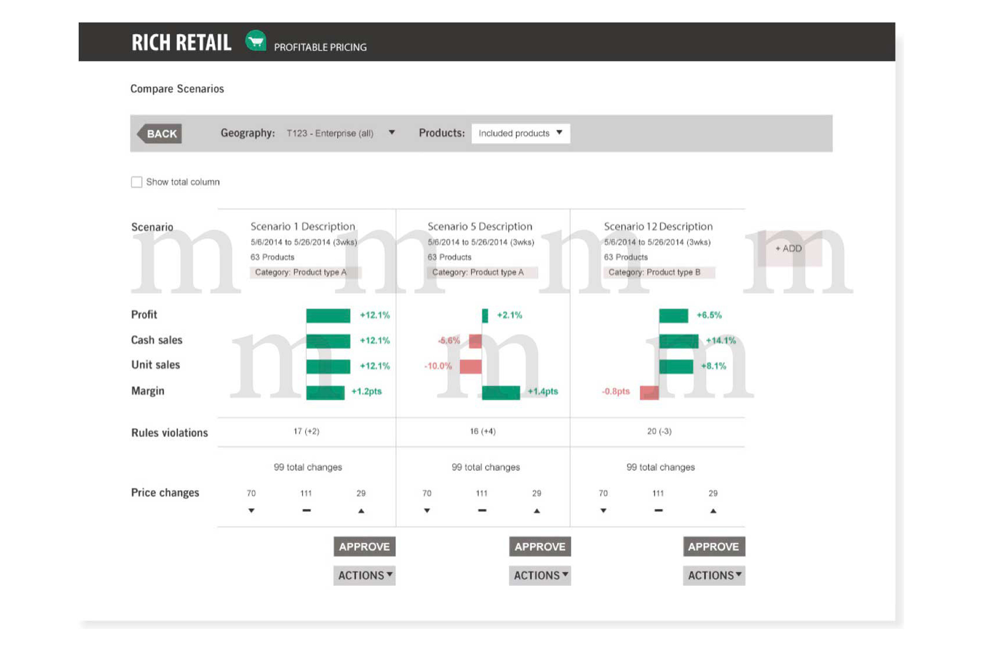
UI design for pricing applications, following the results of UX design processes.
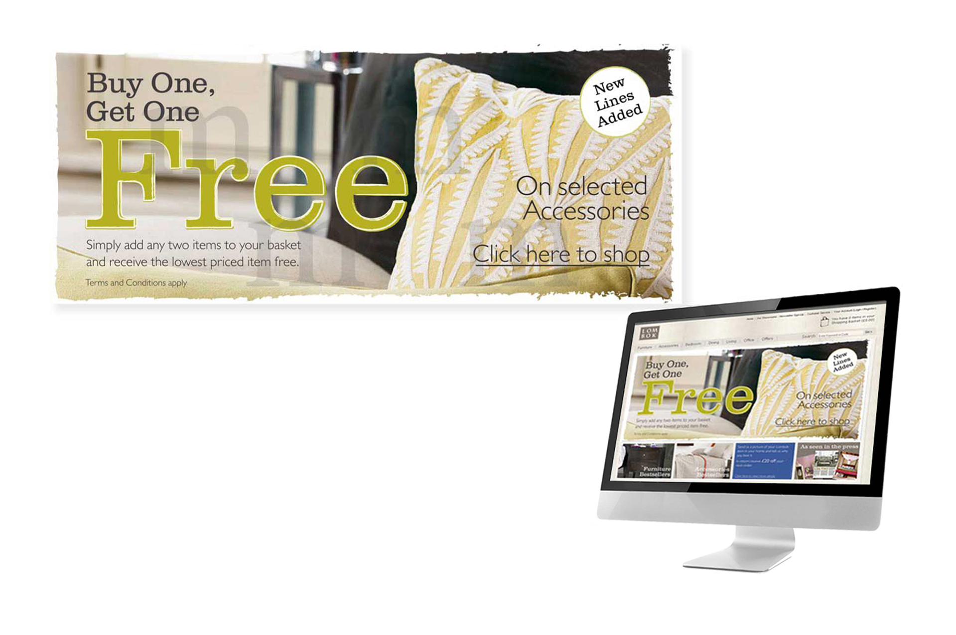
Brief: Create a "Buy One, Get One Free" promotion, on selected handmade accessories.
Result: The rough texture conveyed through the visual design for this promotion, reflects the hand-crafted nature of the accessories on sale, enticing customers to personally handle the products, made from materials such as clay and canvas.
Skills: Design direction on concept through to completion, creation of mood boards and style guides, stakeholder management, team management, project management.
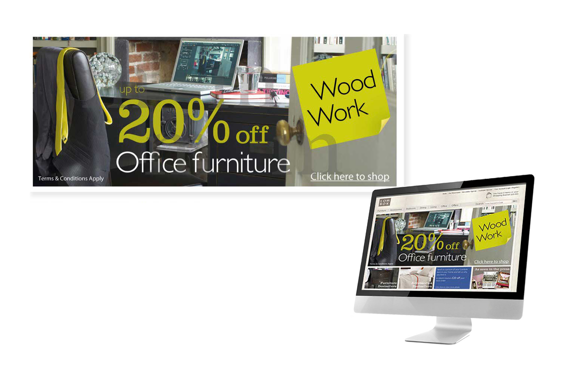
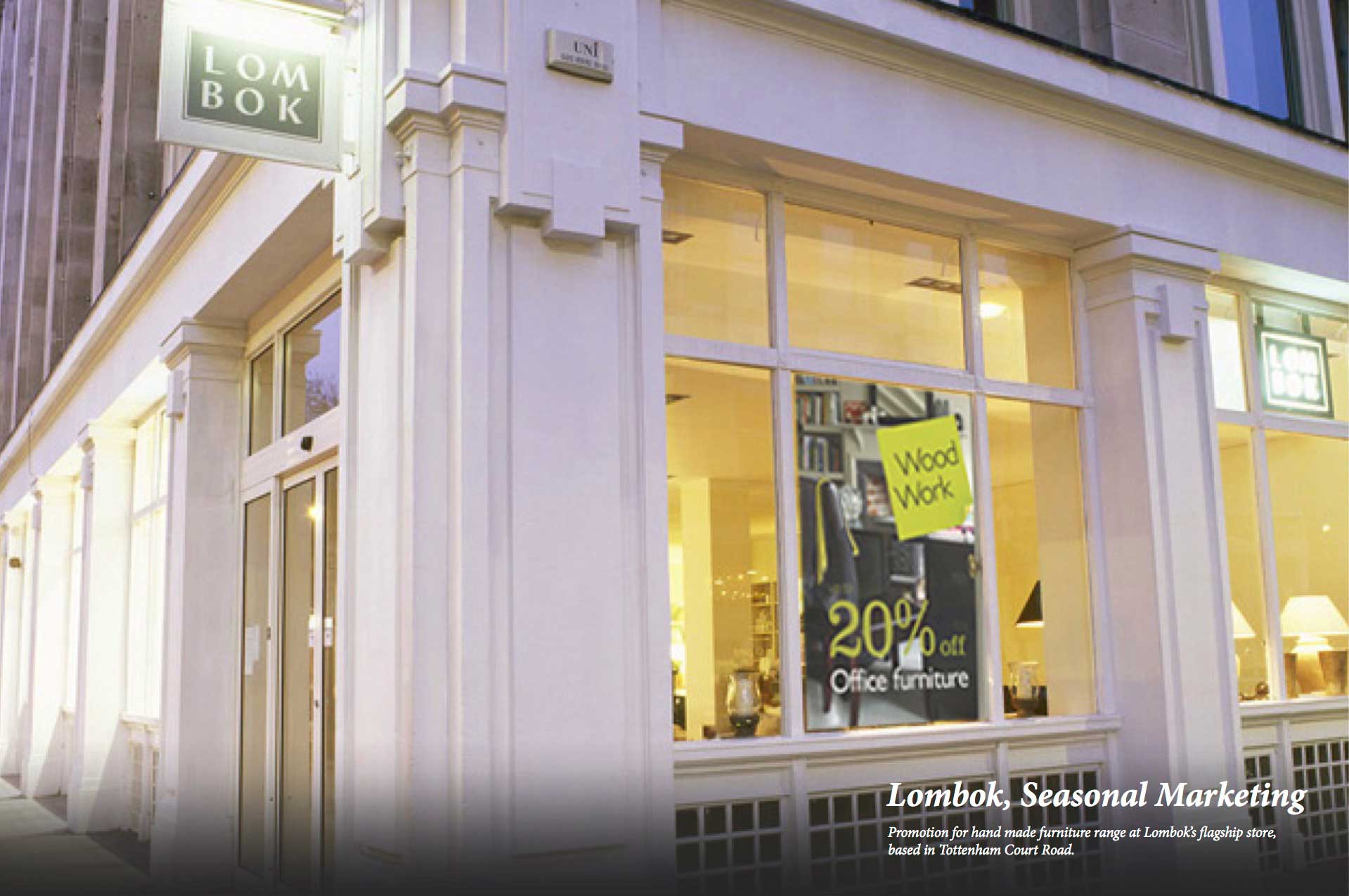
Brief: Create a "20% Off Office Furniture" marketing campaign.
Result: This visual campaign reflects the clean lines of the office products on sale, utilising a uniform colour scheme which is consistent within both physical and online retail environments.
Skills: Design direction, stakeholder management, team management, project management, creation of mood boards and style guides.
Concept and display for visual merchandising, in-store point of sale and seasonal marketing events.
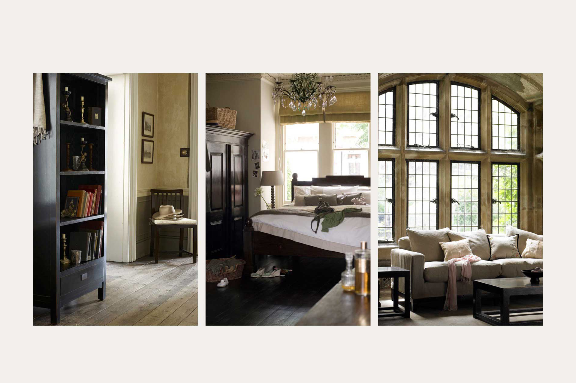
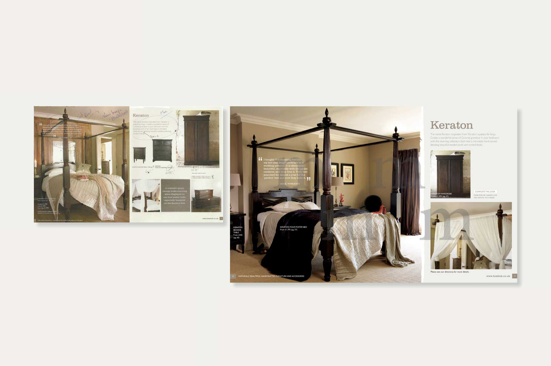
Brief: Art Direction for lifestyle photography displaying products within a country home setting.
Skills: Design direction, stakeholder management, composition, team management, project management. Creation of mood boards and style guides created in Adobe Illustrator, Photoshop and InDesign.
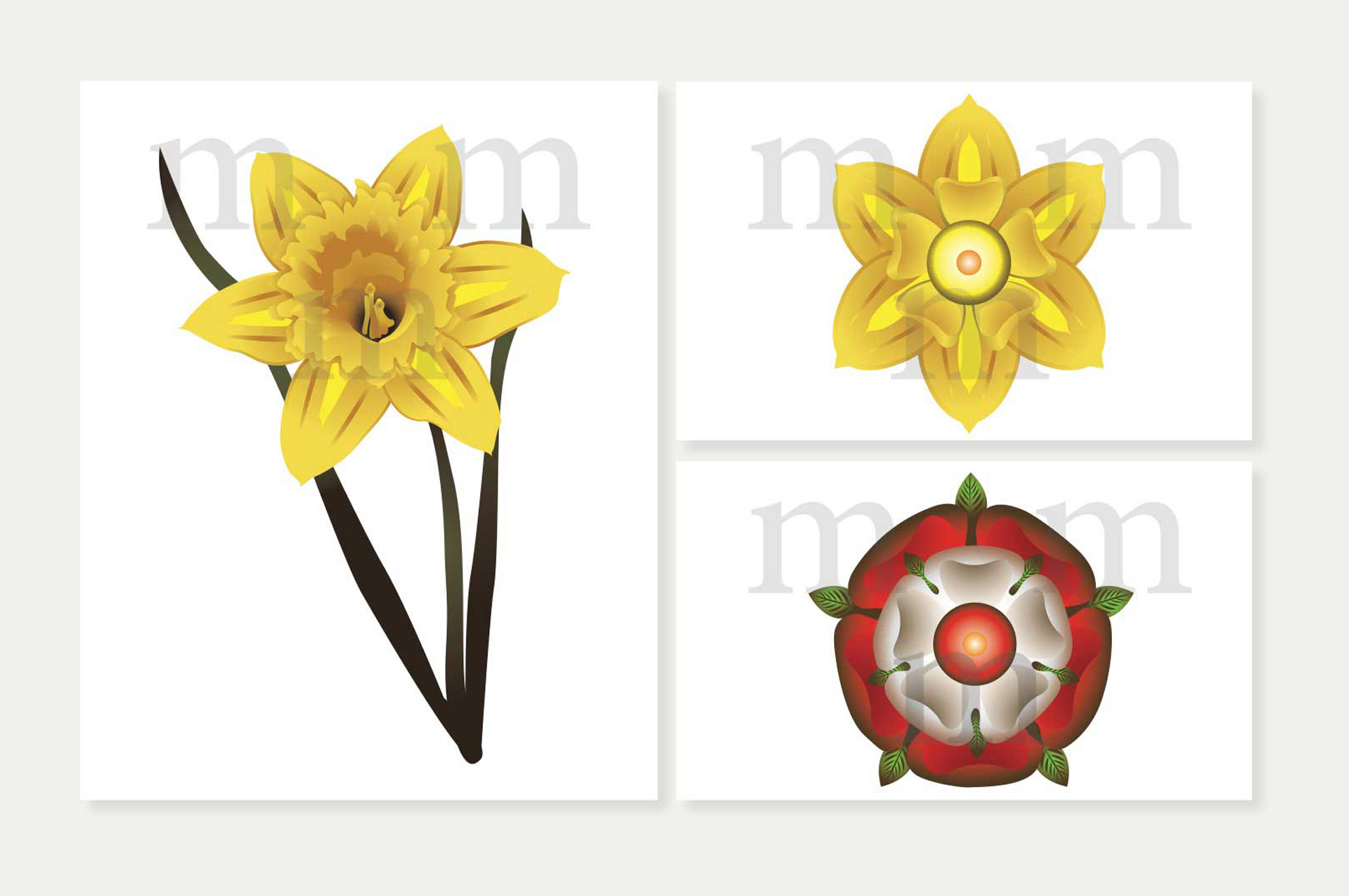
Skills: Vector illustrations of petal patterns in portrait and top views made with Adobe Illustrator.
Brief: Design and direct three short moving image advertisements for TV programmes “Air Crash Investigation”, “Tsunami: The day the wave struck” and “Demolition Squad”, aired on the National Geographic Channel.
Result: The three advertisements link together through an engaging concept making effective use of sound effects and using the National Geographic Channel logo as a metaphor for content.
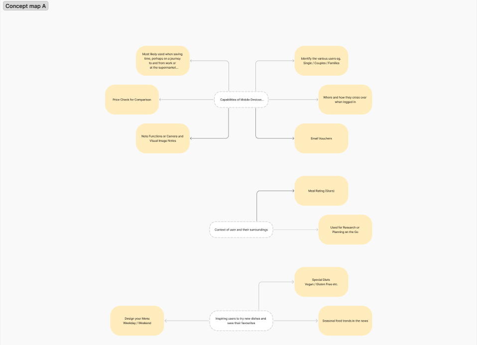
As part of this project, I developed a comprehensive UX concept map to deeply explore and refine the user journey on the BBC Food website. Beginning with user research—interviews, analytics review, and competitive benchmarking—I mapped out core user personas and their primary goals (e.g., quick recipe discovery, dietary filters, and meal planning). This visual framework allowed me to pinpoint critical interactions, highlight decision points, and uncover friction areas where users might abandon their tasks.
With the concept map established, I focused on strategic information architecture improvements: reorganizing navigation categories, consolidating redundant links, and surfacing high-value content more prominently. By outlining potential pain points—such as buried filters or confusing labeling—I created clear design recommendations to streamline workflows and reduce cognitive load. This structured approach provided stakeholders with a shared vision for future iterations, ensuring that every design decision is grounded in real user needs and analytical insights.